class-08 summary
CSS Layout :
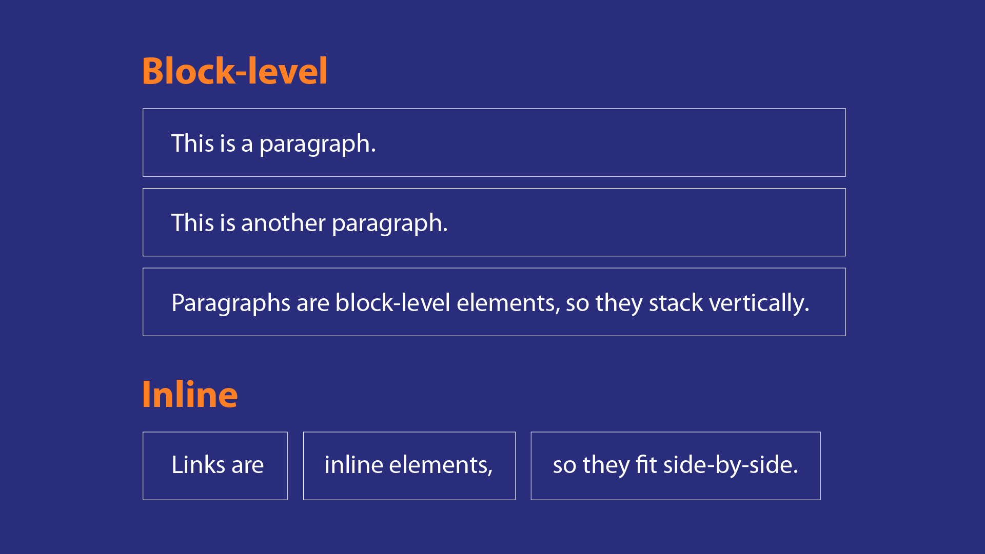
- In CSS all HTML elements can be considered as boxes,each box will either be a block-levelbox or an inline box.
- Block-level boxes start on a new line and act as the main building blocks of any layout, while inline boxes flow between surrounding text.
- To control how much space each box takes up set the width/height of the boxes.To separate boxes ,use borders, margins, padding, and background colors.
- If one block-level element sits inside another block-level element then the outer box is known as the containing or parent element. But,if a box is nested inside several other block-level elements. The containing element is the direct parent of that element.
- < div > elements are often used as containing elements to group together sections of a page.
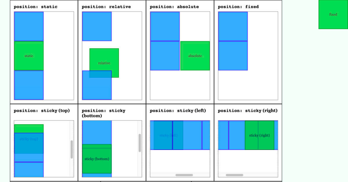
- CSS has different ways to position elements using the position property : normal flow, relative positioning, and absolute positioning .Also using the float property to float elements .
- Normal flow (position : static): Every block-level element appears on a new line, causing each item to appear lower down the page than the previous one.
- Relative Positioning( position:relative ): This moves an element from the position it would be in normal flow, shifting it to the top, right, bottom, or left of where it would have been placed.
- Absolute positioning ( position:absolute , ex :Fixed Positioning): This positions the element in relation to its containing element.
- To indicate where a box should be positioned, you need to use box offset properties to tell the browser how far from the top or bottom and left or right it should be placed.
-
Fixed Positioning ( position:fixed ) it is a form of absolute positioning that positions the element in relation to the browser window. Elements with fixed positioning do not affect the position of surrounding elements and they do not move when the user scrolls up or down the page.
- Float property allows you to take an element in normal flow and place it as far to the left or right of the containing element as possible Anything else that sits inside the containing element will flow around the element that is floated.Also, can be used to create multi-column layouts.
- z-index property(stacking context) allows you to control which box appears on top.Its value is a number, and the higher the number the closer that element is to the front.
-
Clearing Floats The clear property specifies what elements can float beside the cleared element and on which side.It can take the following values: left ,right, both or none.
- Using the float property can cause a startling problem for CSS newbies: If floated elements have non-floated parent elements, the parent will collapse.
- Solution 1 : Float the parent.
- Solution 2 : Give the parent an explicit height.
- Solution 3 : Append a “spacer” element inside the parent element.
- Solution 4 : Set parent to overflow: auto
- Many web pages use multiple columns in their design. This is achieved by using a < div > element to represent each column. The following three CSS properties are used to position the columns next to each other:
- width : This sets the width of the columns.
- float : This positions the columns next to each other.
- margin : This creates a gap between the columns.
- Various devices have different screen sizes and resolution, so,they show different amounts of information, so your design needs to be able to work on a range of different sized screens. Web designers often try to create pages of around 960-1000 pixels wide because most users will be able to see designs this wide on their screens.
- Resolution refers to the number of dots a screen shows per inch. Some devices have a higher resolution than desktop computers and most operating systems allow users to adjust the resolution of their screens.
- Fixed width layout designs do not change size as the user increases or decreases the size of their browser window Measurements tend to be given in pixels.
- Liquid layout designs stretch and contract as the user increases or decreases the size of their browser window. They tend to use percentages.
- Compositionis the placement of elements and how they are organized on a page. Many designers use a grid structure to help them position items on a page, and the same is true for web designers.
- Grids set consistent proportions and spaces between items which helps to create a professional looking design.
- Creates a continuity between different pages which may use different designs
- Helps users predict where to find information on various pages.
- Makes it easier to add new content to the site in a consistent way.
- Helps people collaborate on the design of a site in a consistent way.
- CSS frameworks aim to make your life easier by providing the code for common tasks, such as creating layout grids, styling forms, creating printer-friendly versions of pages and so on. You can include the CSS framework code in your projects rather than writing the CSS from scratch.